Vaccines are working: charts that show the Covid endgame

Roula Khalaf, Editor of the FT, selects her favourite stories in this weekly newsletter.
It is easy to feel as if the coronavirus pandemic is getting out of control again. The rate of new cases hit a record last week, with 5.2m people around the world getting infected, according to data from Johns Hopkins University.
Three months ago, many in India were celebrating the prospect that the country was approaching herd immunity; now the number of new cases is growing at an alarming rate.
In Europe, regulators and politicians are still trying to manage the safety concerns that have been raised about the AstraZeneca vaccine: in the US, health agencies have suspended use of the J&J jab.
But the flurry of depressing headlines cannot disguise one thing: it is now clear that the vaccines are working. In countries where cases have been falling in recent months, the vaccines have saved lives. And in countries that are still struggling to suppress a third or fourth wave, the vaccines have also saved lives.
An FT analysis of data from five countries — each facing very different scenarios — finds that rates of infections, hospitalisation and death have traced a lower path among the older, most vaccinated age groups than among younger cohorts, who are least likely to have received the jab.
This is regardless of the viral caseload — whether infections are rising or falling, or if a country is grappling with one of the new variants.
The results are in stark contrast to the patterns seen during earlier viral waves, before the vaccines were introduced, when older age groups consistently saw rates of illness decline more slowly than the young.
None of this is to diminish the challenges that lie ahead. The data also show that for large parts of the developing world where vaccines are more scarce, many millions will remain at risk for months to come.
But in the countries that have vaccinated the largest shares of their populations, there are tentative signs, as shown in the FT’s charts below, that the Covid endgame may be in sight.
The UK’s vaccine effect
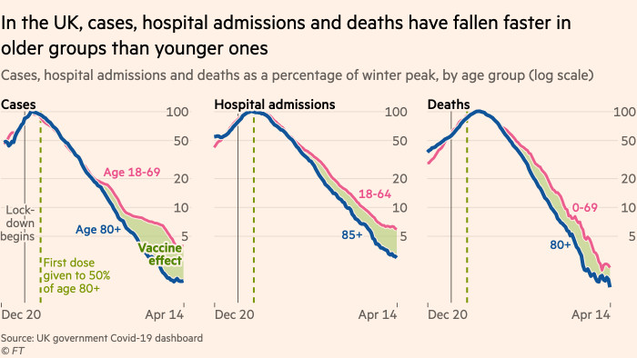
In the UK, rates of cases, hospital admissions and deaths have fallen steadily since January among all age groups, suggesting that restrictions have helped suppress the towering winter wave of infections. But beneath the surface trend, rates of all three measures have fallen further and faster among the elderly, most-vaccinated groups.

Proof by age
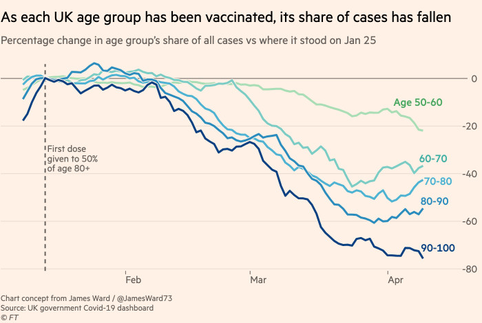
Indeed, the impact of the UK’s strict prioritisation of vaccine access according to age is readily seen in the data on cases. As each age group became eligible for vaccination, its share of all cases has fallen away. The share of cases among the over-80s has fallen by 80 per cent since vaccinations began.

The vaccine effect in France
Across the Channel in France, a third wave of the virus has hampered progress, but the same tell-tale signs are evident. Rates of cases and hospitalisations ticked back upwards in March, but climbed far more slowly among the most-vaccinated age groups than the least. Deaths continued to fall among the elderly despite a resurgence among the young.

The threat of B.1.1.7
The resurgence of the pandemic in France — and many others in recent weeks — was fuelled by the arrival of the B.1.1.7 variant that originated in the UK in September. By March, it had become the dominant variant across all of Europe and is now spreading across North America.

The US experience
The arrival of the “UK variant” in the US threatened one of the world’s most impressive vaccination rollouts, but as in France the data suggest the vaccines are still performing exactly as hoped. While the variant has sent rates of hospital admission rising, that increase has been driven by the young, while rates of admission among the elderly have continued to decline.

Chile confronts a third wave
The sternest test for the vaccines has come in Chile, where a rapid rollout of China’s Sinovac jab coincided with a substantial third wave of the virus. But once again the age breakdowns tell a hopeful story about the vaccines. Occupancy of intensive care units has more than doubled among younger adults, while falling among the age groups prioritised for vaccination.

The global battle continues
Many countries are still battling severe outbreaks. Foremost among them is India, which is currently reporting more than 200,000 new cases a day. The share of its tests that come back positive is climbing faster than any other country, suggesting that many cases are being missed, and in the hardest-hit parts of the country, ICUs are full to overflowing. Only 8 per cent of the population has received at least one vaccine dose to date.

Latin America’s struggle
Like India, most of the countries still battling brutal outbreaks are in the developing world. But in Latin America, Uruguay has reported a surge in its daily Covid-19 death toll from 1.15 per million on March 1 to 18.55 on April 15, putting it third highest in the world. Neighbouring Argentina and Brazil are also suffering climbing death tolls from the virus. The latter has added 123,000 deaths in the past two months, taking the total to nearly 375,000.

Key data found in excess deaths
The greater availability of Covid-19 data in the western world has at times given the impression that the US, UK and pockets of Europe have been the hardest hit by the pandemic, but a more comprehensive analysis shows that Latin America has unquestionably suffered the most. Using the concept of excess deaths — the number of people dying from all causes above the seasonal norm — Latin American countries have four of the five highest death rates globally.

The Covid endgame?
The key to bringing India and Latin America out of the pandemic is the same as it is everywhere else: vaccines. After a year in which hundreds of millions have lived under restrictions in order to save lives, the goal is to reach the point where people can spend more time socialising with few restrictions while cases continue to fall. Israel appears to have arrived at the Covid endgame, and the UK is hot on its heels. As countries continue their vaccination programmes, more will join them.

Comments