Hue are we? A decade in colour
Roula Khalaf, Editor of the FT, selects her favourite stories in this weekly newsletter.
The dawn of a new decade presents a seductive opportunity to look back, take stock and bring meaning to what has gone before. In terms of trends, just one conclusion can be drawn from the past 10 years: that change was the only constant – and never more so than in the realm of colour. This perhaps explains why colour predictions, dubbed the Colour of the Year (COTY) by big colour and paint brands, have become increasingly popular in this timespan. But aren’t these just marketing ploys designed to push product and encourage us to repaint our homes every year? Is it really possible to designate a single hue to represent an entire year, especially in advance? Even the Oxford Dictionary ascribes its Word of the Year retrospectively (2018’s was “toxic”, in case you’re wondering; 2019’s has just been revealed as “climate emergency”).
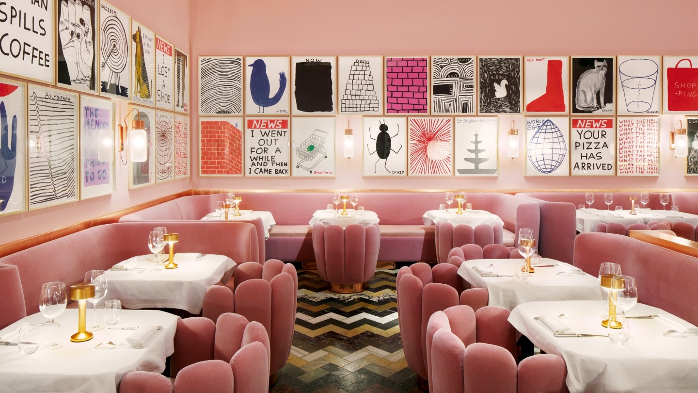
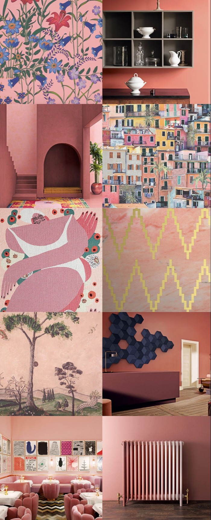
And yet, when colour predictions are based on a rigorous analysis of the prevailing cultural temperature, they can be an extraordinarily accessible way to convey the mood of the moment. Or, to put it another way, colour trends symbolise the inherent ability of colour to affect, and thus reflect, the way we feel. Consider Millennial Pink. Appearing roughly mid-decade, this was a colour that went mainstream and global, although you probably can’t quite put your finger on its precise spectral tone. In more ways than one, this was its point. Neither saccharine-sweet nor completely desaturated but somewhere in between, it was positioned as the new neutral. Emblematic of burgeoning conversations about gender fluidity, it was eagerly adopted by men and women (and any gender we care to insert in between) to make a statement about their emotional openness and modernity.
But context is everything. Millennial Pink gained worldwide traction because terms such as non-binary and transgender had already bubbled up to broader public consciousness from their subcultural roots. Plus, as a pure shade it embodied the inherently soothing qualities commonly attributed to pink, thereby also acting as a timely panacea for the turbulent times (it’s no accident that healing lotions and potions are often tinted this hue – think Pepto-Bismol and Germolene). In this way, its enduring “success” owes a debt to the perfect correlation between its initial intent and the colour’s intrinsic qualities. Crucially, although the trend forecasters gave it a name, the colour originated authentically on the street.
We were also overdue some warmth. In the home, the decade began with Scandinavian chic: all sombre greys, cool monochromes and bleached wood – the go-to for interiors for the next five years. Then, alongside the powder pinks, our living rooms were gently infiltrated by other ice-cream shades – pistachio green, lavender, even peach – as we permitted ourselves a little more optimism about the world. In retrospect, perhaps this should be viewed as rose-tinted escapism, as the age of protest was just around the corner. In fact, 2016 to 2017 were years of extremes and the chromatic tide duly turned. Brexit began, Trump became US president, terrorist attacks and natural disasters grabbed headlines. By 2018, politically, economically and ecologically, the world was looking pretty messy.
At this point, some forecasters heralded the rise of Gen-Z Yellow. However, just giving a colour a zippy name doesn’t make it happen. Sure, fashion retailers were clocking healthy sales of yellow must-haves – it’s a naturally joyful, bright colour. And who can forget Amal Clooney arriving at a certain royal wedding, splendid in saffron Stella McCartney (searches for yellow dresses went up 1,500 per cent the following week, according to the global fashion search engine Lyst). But these same retailers also noted an upswing in scarlet and blue items too. In truth, the broader picture was that all fashion brights were finding favour in a very devil-may-care rainbow mash-up. I’d suggest this was the natural reaction to the escalating chaos of the world; it’s the same caution-to-the-wind response that causes lipstick sales to peak during a recession.
On the catwalks, though, it was less about primary Crayola colours than superbly sophisticated jewel tones – topaz to terracotta, citrine, amethyst, aquamarine, teal and turquoise – all arranged in unusual combinations (epitomised by Alessandro Michele’s kaleidoscopic 2018 Gucci collections). And this sultry “new maximalism” translated directly into the home. Velvet was the upholstery fabric du jour, from high-end to high street, and richly patterned wallpapers and exotic marbles finally supplanted Scandi style.
But the swing of the trend-pendulum is nothing if not rhythmic, so counter to all this vivacity, by early 2019 beige was (whisper it) also appearing on the radar. In some ways, it was then the equivalent of sticking your head in the sand and hoping everything would sort itself out – the very opposite of the noisy clamouring for change seen elsewhere. Nevertheless, it mirrored the emerging use in interiors of previously deemed “humble” materials: cork, plywood, sisal, hemp and wicker – finishes that were affordable, sustainable, profoundly textural and, colourwise, decisively neutral.
Had I selected a COTY for 2019 though, it would have been a deep ochre mustard: a colour trope of hope to tread a conciliatory line between the full-fat brights and any hint of greige neutrality. A shot of heat to signify that the time was nigh to stop talking and start doing. Mustard is, after all, tremendously adaptable, warming without overwhelming and capable of converting the mundane into marvellous – not for nothing is it one of the world’s most widely employed condiments. Instead, paint brand Dulux named Spiced Honey, an American-tan-tights brown, for 2019, and the international colour company Pantone – which has been making such pronouncements for 20 years – presented us with Living Coral, a sort of incandescent peach, officially described as “a nurturing colour that appears in our natural surroundings and…displays a lively presence within social media”. Except that our coral reefs were, and continue to be, catastrophically bleached white into oblivion by climate change, and prior to the reveal, I’d not heard an iota of chatter online about this supposed agenda-setting shade.
Nonetheless, there has occasionally been a sliver of accord between these two colour prediction giants. In 2012 – a pivotal year in which Putin again became president of Russia, the Olympics were staged in London, a probe landed on Mars and President Obama was re-elected – Pantone gave us Tangerine Tango, which looks precisely as it sounds, and Dulux proffered a smoky paprika-red. Squint, and they’re almost in the same family. They nearly concurred again in 2015, when Millennial Pink first appeared, albeit Pantone debuted Marsala, an earthy wine red to Dulux’s Copper Blush, a peachy-pinky red. But from then on they wildly diverged, with Dulux showing a series of increasingly muted tones in comparison with Pantone’s progressively strident choices – from an unapologetic Kermit green for 2017 to Ultra Violet in 2018, rapidly dubbed “ultra-violent violet” as there was little in this supposedly “provocative and thoughtful purple” that was likeable.
But does any of this really matter? Surely we all go about our business cheerfully choosing whatever pleases us in fashion and home furnishings? Apparently not, as 85 per cent of consumers reputedly place colour as a primary reason for any purchase (according to research by web design and marketing company WebPageFX), and when bombarded with choice at every turn, being told that one shade embodies the moment can be immensely reassuring. You will be instantly “on trend” and “happening” all with the purchase of a hat, handbag, carpet or cushion. As colour psychologist Karen Haller says, “As human beings we have an innate sense of wanting to belong, to fit in, so picking COTY colours is often a response to this.”
Let’s turn then to the predictions of the Color Marketing Group, significantly a not‑for-profit international association of colour design professionals. Founded in 1962, it uses the tagline “color sells, and the right colors sell better”. At its 2018 International Summit, it proposed four key colours for 2020 determined by region in acknowledgment of the global intricacies of colour meaning. Thus, a pinkish clay-brown was proposed for Europe (“engaging with the aromatic and tactile”); a warm neutral beige for Asia Pacific (“the antithesis of rampant technology”); North America got a complex greenish-gold (symbolising “an age of numerous possibilities”); and Latin America a dark green named Ver-de-Verdad, representing the need to “act in the interest of everyone, and everything, on the planet.”
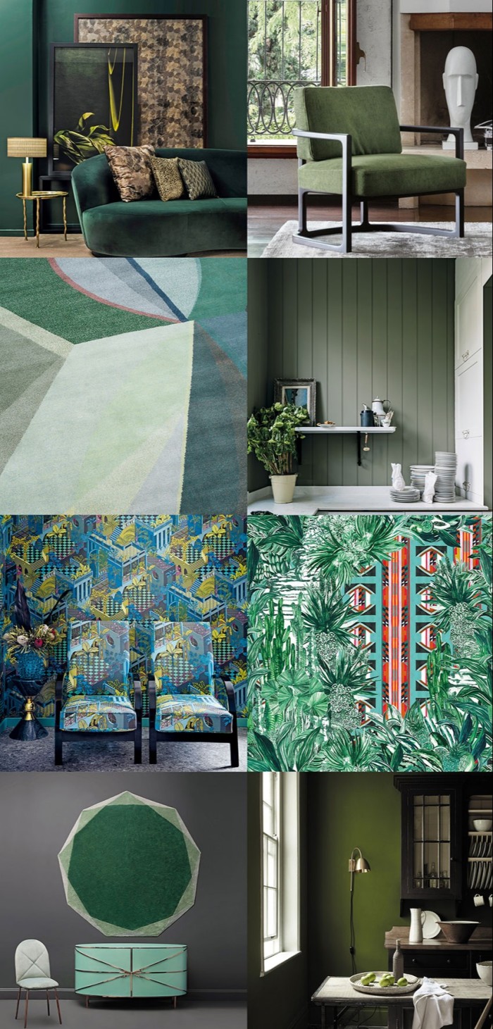
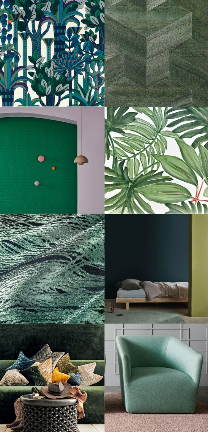
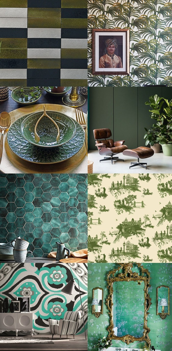
With this mix it was probably closest to the mark for 2020, as there’s no doubt that the dominant narrative right now is “green” on every level. Issues of sustainability and the environment are mainstream and centre stage. Technology has increased the pace of life beyond what many can cope with, and Biophilic design – which emphasises a connection with nature – is enthusiastically regarded as the progressive way forward for both our work and home spaces. And, for once, there seems to be broad agreement: the Little Greene Paint Company (with its long-established eco credentials) recently launched a new palette of 31 colours in collaboration with the National Trust, all based on historic greens; Dulux’s 2020 COTY prediction is a rather lovely pale greyish green called Tranquil Dawn; a bestselling colour from the historic London-based paint company Mylands is currently an intense dark green (Borough Market); and the US-based Behr paints named a fresh, yellow-based green as its 2020 COTY.

Regardless, the dominance of green should prompt great optimism. It connotes rebirth and fresh starts, and signals awareness turning to action as people realise their individual power and stand up to be counted. Importantly, its ascending popularity is born of authenticity not marketing. This is not to say the path ahead will be easy. Behind the greens, therefore, I’d wager a return to monochrome. Imagine modernist palettes like those of new paint brand Gris, with its collection of just 15 ultra-matte mineral paints. The brainchild of former make-up artist Liz Michael, it’s an exquisitely curated and timeless ensemble of Nordic cloudy whites, architectural greys and smoky inky blues that are also completely free of any solvents, synthetics and acrylics. The Paint & Paper Library, too, recently released a set of black and white shades in collaboration with the Royal Institute of British Architects. Presented as a set of six pairs, each possesses the subtlest of co-ordinated undertones from ochre to grey, blue and green.
And the nuanced approach is key. Ten years ago monochrome may have seemed hard and cold, but this iteration will be particular for its superb texture and quality of finish, much as we’re seeing with fashion’s now updated flirtation with beige – less magnolia nylon than butter-soft malty caramel leathers and sandy cashmeres teamed with crisp white shirts. Lest we forget, white too is immune to the fluctuations of style, characteristic of a desire to soar above the emotional maelstrom. As Chrissie Rucker, founder of The White Company concludes in the introduction to her new book, For the Love of White: The White & Neutral Home, “In our hectic age – an era of constant connectivity – the idea of creating a peaceful white home and its relationship with calm and wellbeing seem more valuable than ever.” Indeed, when the future is uncertain, we return to the familiar, and monochrome is always a safe, elegant harbour, much like beige, when it’s done well.
Nevertheless, while white will always be a part of my interiors palette, looking to the future Pantone has just announced that its COTY is Classic Blue and I shall be introducing a dark navy into my home. The draw lies in its solidity. It is reassuring without being harsh, grounding while also connoting freedom from convention, and that feels good to me right now. The point is, paint is like make-up, easy to apply, easy to change – so I can always reapply. And I suggest you treat colour trends in the same light-hearted way. As Marianne Shillingford, creative director of Dulux, puts it, “Trends should not be abstract or inscrutable, they should be something we connect with because they reflect who we are, and what’s important to us.”
Comments