Edward Tufte

Simply sign up to the Life & Arts myFT Digest -- delivered directly to your inbox.
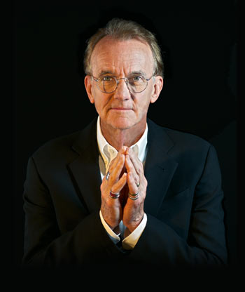
Edward Tufte is the guru of graphics, the high priest of presentation. For more than 30 years he has been showing us how to visualise data with simplicity, clarity and elegance, while campaigning against “chartjunk” and other design practices that lead to obfuscation.
Tufte, 71, was born in Kansas City, Missouri and grew up in Beverly Hills, California. He started his academic career as a political scientist at Princeton University and moved seriously into data visualisation in 1975. He was prompted by a request to teach a statistics course; the low standard of statistical graphics available in the literature made him realise that he could do better himself.
In 1977 ET (as he often calls himself) moved to Yale University, where he was to spend the rest of his academic life as professor of political science, statistics and computer science. After finishing his magisterial The Visual Display of Quantitative Information in 1982, the perfectionist Tufte could not find a publisher able to match his high standards of production and layout. “Publishers seemed appalled at the prospect that an author might govern design,” he observed later.
So Tufte invested in a full-scale self-publishing project, taking out a second loan on his home (at a time when the mortgage rate was 18 per cent). The resulting book, integrating graphics cleanly into the text in a way no one had achieved before, is a design classic, now in its 24th printing. Tufte’s self-publishing operation, Graphics Press, has published three more fine books by him – Envisioning Information, Visual Explanations and Beautiful Evidence – as well as pamphlets and other works.
His most influential illustrated essay was The Cognitive Style of PowerPoint (2003), a brilliant critique of the way Microsoft’s presentation program so often kills clarity in a hail of bullet points and PowerPointPhluff. The pamphlet’s cover – showing a huge 1956 Soviet military parade dotted with little thought bubbles, such as “There’s NO bullet list like Stalin’s bullet list” and, from a poster of Chairman Mao, “For re-education campaigns, nothing is better than the AutoContent Wizard” – says it all. More seriously, Tufte showed how Nasa engineers used PowerPoint in the lead-up to the 2003 Columbia disaster, in a way that obscured evidence about the damage suffered by the Shuttle during its launch.
Since leaving Yale in 1999 (with the title of professor emeritus) Tufte has pursued an active programme of freelance teaching, writing and, increasingly, sculpting. Some of Tufte’s powerful 3D work is currently on show at his ET Modern gallery in New York.
——————————————-
Who would you predict is the person or organisation in your field whose work will be most important in the future?
I suggest keeping an eye on the work of Bret Victor and Mike Bostock. Both are cutting edge. Bret Victor visualises programming, sees and thinks beautifully, just starting to blossom (see worrydream.com). Mike Bostock (see bost.ocks.org) developed the open-source D3, Data-Driven Documents (d3js.org).
…
What is your favourite graphic created by someone other than yourself in any field of graphics?
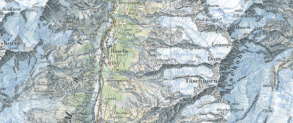
1 Swiss mountain maps
A standard of excellence for serious information displays.

2 Napoleon’s Russian campaign 1812-13, Charles Joseph Minard
The chart, prepared in 1869, shows the losses of the Grande Armée on its march to and retreat from Moscow. It plots the size of the army, its location and direction, and the temperature on various days of the retreat. It may be the best statistical graph ever drawn.
…
If you had to represent what you do in only five examples of your work, which five would you choose?

1 Sparklines: small, intense, word-sized data graphics
In the example above, the financial table reports 24 numbers to 5 significant digits; the sparklines show about 14,000 numbers readable from 1 to 2 significant digits. The idea is to be approximately right rather than exactly wrong.

2 All Possible Photons: The Conceptual and Cognitive Art of Feynman Diagrams
These artworks grow out of Richard Feynman’s famous diagrams describing Nature’s subatomic behaviour and generate an enormous multiplicity of three-dimensional optical experiences.
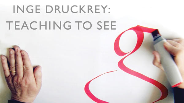
3 Inge Druckrey: Teaching to See, a 2012 documentary film

Discussion of important principles of seeing, analysing and executing by Inge Druckrey, her students and colleagues.
4 Airport signal people

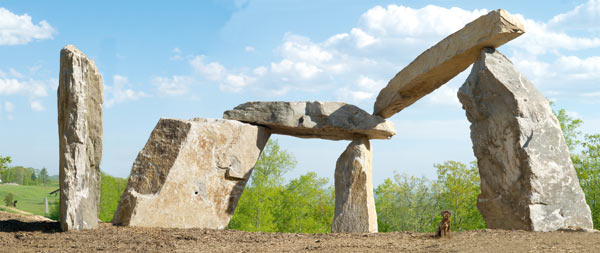
5 Continuous silent megaliths: structures of unknown significance
I think of the pieces as being made from two materials, stone and air. Much of the thinking about the works is devoted to seeing and reasoning about the airspaces generated by positioning the stone.

…
Who were your biggest influences in your field?
• John W Tukey and William Cleveland
Tukey had opened up the field in the mid-1960s, as his brilliant technical contributions made it clear that the study of statistical graphics was intellectually respectable and not just about pie charts and ruling pens.
Bill Cleveland followed up brilliantly.
• Galileo
Best information visualiser for centuries.
• John Snow
John Snow did his brilliant street-corner detective work (founding modern epidemiology), discovered the cause of a cholera epidemic, and induced the parish council to remove the handle of the Broad Street pump in London, which ended the epidemic. It’s more complicated than that, but the great contribution of John Snow was to identify the public health policy that ended cholera epidemics in England: keep the drinking water clean.
• Eduard Imhof
Imhof is one of the people responsible for the great Swiss national maps, one of the best information designs ever. His deep and essential book, Cartographic Relief Presentation, is about how to show mountains on maps (which means that it is about nearly everything, since the book shows all sorts of methods for escaping the flatlands of paper and screen).
• Robert Venturi, Denise Scott Brown and Steven Izenour
Their book, Learning from Las Vegas, is delightfully contrary and provocative.
Comments