Cost curves
Roula Khalaf, Editor of the FT, selects her favourite stories in this weekly newsletter.
As bulk and base commodities continue to fall because of rising supplies and weak demand, investors are trying to make sense of it all. One useful tool is a cost curve.
So what is a cost curve?
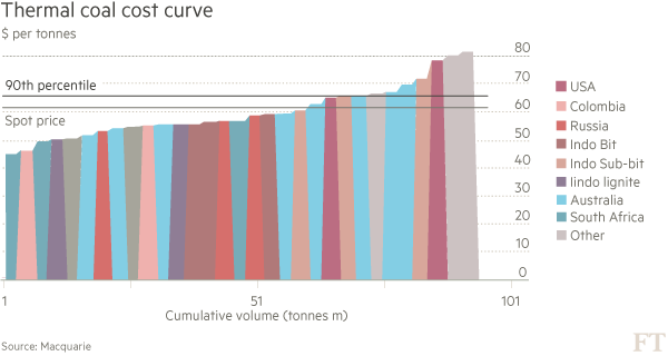
Basically, it’s a graph that plots the production capacity and costs of an entire industry, see the case below. On the X-Axis, cumulative production is ranked. Producers (or projects) are laid out from low to high cost and bars are used to indicate their output — the wider the bar the more they churn out. On the Y-Axis is the cost of production. The result is rather ugly looking bar chart that slopes upward; left to right. (see below)
OK, I get that. But why is this helpful?
It provides a quick snapshot of the industry. Investors can overlay the current price if a commodity on to the cost curve to and judge which producers are economic — and which are not. Generally, producers want their operations be in the lowest quartile. That’s especially true in a falling price environment. Cost curves have other uses. They can also be used to estimate price support levels and where the high-cost producer sits in a given industry.
Is that where the 90th percentile comes in?
Beyond the 90th percentile are the projects that produce the 10 per cent of global output at the highest cost. They are generally considered the “marginal producers”. If prices fall below the cost of production for these higher-cost producers for a sustained period, the theory is that they should stop producing and so bring supply and demand back into balance. In that way, the 90th percentile can be seen as offering a measure of price support and a rough idea of the break-even price.
So what’s the catch?
Good question. The answer is that commodity prices can remain below key support levels on the cost curve for a long time. Thermal coal, for example, has traded below the 90th percentile for the past three years and little or no supply has come out of the market. It’s only now that the balance sheets of the lossmaking coal producers are coming under real strain and they are considering closing or mothballing mines.
There are other weaknesses. Calculations of costs can differ and it can be hard to capture all of the production capacity in an industry, especially if there are lots of small mines in far-flung rural areas of the world.
So what’s happening with cost curves at the moment?
In many commodities, they are shifting lower because of lower fuel prices, freight costs and weaker commodity currencies. Effectively this means more mines will remain profitable even at the current low commodity prices. In other words, low prices are allowing some producers, who would otherwise have gone to the wall, to stay in business. The result is supply remains in the market, weighing on prices.
For example, at just above $62 a tonne, iron ore prices have fallen to a five and-a-half year low. But Macquarie, the investment bank, estimates that the top end of the iron ore cost curve has declined $30 a tonne because of deflation in the mining industry.
This article is part of an online series on commodities made easy. The text has been amended to clarify the case study.
Further reading:
Oil price plunge means survival of fittest
End of the Iron Age
Glencore considers cuts at South Africa coal unit Optimum
Also read:
Commodities explained: The price-supply disconnect
Commodities explained: Contango
Commodities explained: Qingdao

Comments